Portfolio
View Our Design Portfolio
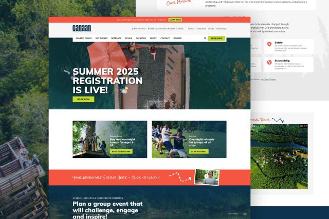
Camp Canaan engages summer camp participants, weekend retreat guests, and day event visitors on a beautiful, 100-acre island located in the middle of the Catawba River. Having significantly grown their mission and offerings, they needed the help of Beyond Marketing to refresh their website to include an updated design, enhanced media capabilities, improved user navigation, and refreshed, optimized copy.
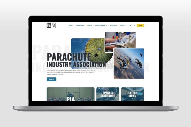
PIA is an international authority on parachute safety, innovation, and best practices. We were thrilled to be tasked with designing a new website that would represent PIA’s diverse membership, improve the user experience, integrate e-commerce for 500+ downloads, and promote events. Our deep understanding of the organization, its mission, values, and membership made this project a perfect fit for Beyond Marketing.
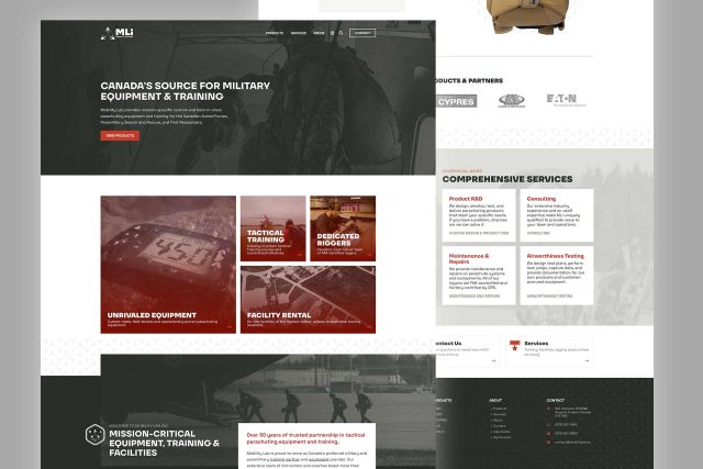
Mobility Lab, Inc. is an industry leader in mission-critical parachute systems and training for the Canadian Armed Forces, Paramilitary, Search and Rescue, and First Responders. When they initially engaged us, MLi was a cutting-edge company with outdated digital assets. We completed a total company rebrand, created a new website, streamlined the customer experience, and greatly enhanced the company’s online presence.
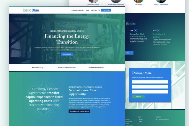
IonicBlue, an elite Energy-as-a-Service (EaaS) provider formed by Johnson Controls and Apollo Global Management, combines industry expertise to drive innovation and reduce operating expenses across sectors. To help IonicBlue stand out in this emerging industry, Beyond Marketing created a clean, optimized website with representative imagery, easy-to-read copy, and clear calls to action—showcasing their unique value and groundbreaking solutions.
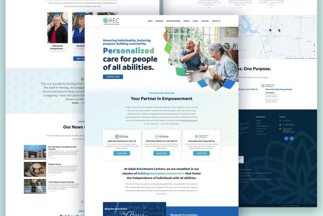
Adult Enrichment Centers supports individuals of all abilities through several distinct programs across multiple locations. Beyond Marketing partnered with AEC in 2021 to conduct a total organization rebrand, create a brand identity guide, and develop a new website to enhance their visibility. We have continued to work with AEC as their mission and programming have grown.
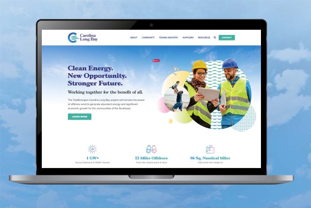
TotalEnergies, a global leader in renewable energy and one of the largest energy providers in the world, has been active in the Carolinas since the 1980s. In 2022, after securing the bid to develop the region’s first offshore wind farm, they hired Beyond Marketing to create a professional brand identity, an engaging website, and polished marketing assets for the TotalEnergies Carolina Long Bay project.