IonicBlue
Energy-as-a-Service Solutions
IonicBlue is an elite Energy-as-a-Service (EaaS) provider formed through a joint venture between Johnson Controls, a global leader in energy and infrastructure solutions, and Apollo Global Management, a leading alternative asset manager. At the intersection of these industry leaders is a veritable powerhouse that is driving innovation and reducing operating expenses in every sector.
EaaS is a relatively new concept, and IonicBlue is a relatively new player in the space. IonicBlue needed a marketing agency that would invest time into getting to know their industry and create a website that would help prospective customers understand the:
- Definition of EaaS and how it works
- Value proposition of their high-profile joint venture
- Radically unique solutions offered by IonicBlue
Challenge Accepted
The Beyond Marketing team jumped head first into learning about Energy-as-a-Service and distilling what differentiates IonicBlue from other EaaS companies. We then embarked on delivering on our promise to produce:
- A clean, crisp website
- Representative imagery
- Easy to read, fully-optimized copy
- Clear calls to action
Brand Identity
IonicBlue had an established logo featuring blue and green text treatment. The brand mark was strong, but the colors felt staid. Our design team lightened and brightened both to more vividly convey a sense of energy, optimism, and future orientation.
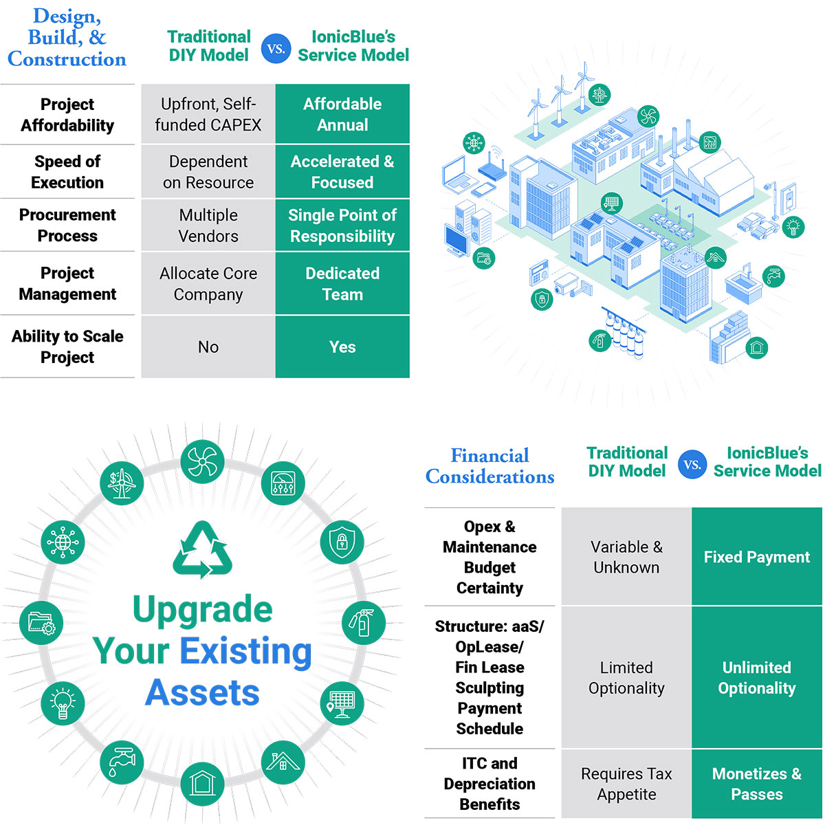
Custom Illustrations
Helping prospective customers understand IonicBlue’s industry and solutions requires a fair bit of explanation. Relying on copy to do so would inundate and potentially lose the user. Instead, we elected to create a suite of illustrations to complement succinct copy, seamlessly imparting additional information and context.
These illustrations also provide visual appeal in an otherwise monothematic landscape of generic images. IonicBlue’s work involves infrastructure, technology, and systems – all interesting and compelling when deliberately photographed. Without those assets, strategic color variation, thoughtful design elements, and custom illustrations carried the design.
Case in point – the sunburst design element. Embedded behind and alongside sections of copy, the burst grabs the reader’s attention, offers a subtle nod to sustainable energy, and hammers home the future-forward aspect of the design.
Website Design
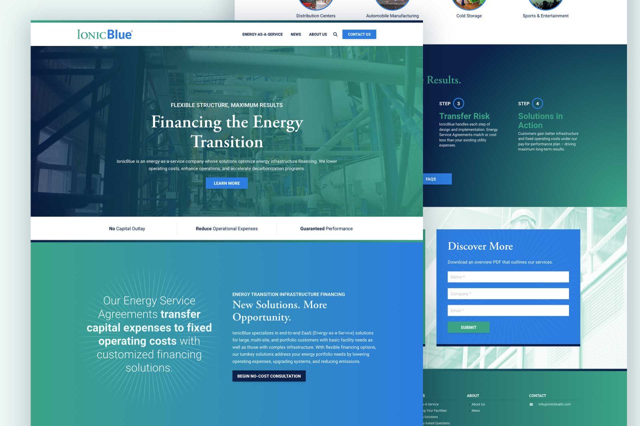
IonicBlue’s original website design featured white copy on a black background and dark, static images. It was difficult to read and outdated, offered limited context clues, and felt rather daunting.
In contrast, the new website feels energized and is easy to read. Energy-as-a-Service is a revolutionary concept that should be accessible and celebrated – and now the IonicBlue website reflects this sentiment. It’s light, welcoming, and informative. The use of white space fosters engagement and promotes the notion of partnership and collaboration.
The navigation menu is intentionally straightforward. It showcases the solutions provided by IonicBlue and offers numerous channels for learning more. Invitations to begin, get started, connect, and discover are prominently featured on every page, reinforcing calls for progress and prosperity.
Client Feedback
Team IonicBlue and their colleagues at Johnson Controls and Apollo Global Management are thrilled with the new IonicBlue website. It checks every box on their list of requirements – and then some. It’s fresh and accessible, polished and professional, and easy to self-maintain. Their website is now representative of the IonicBlue brand, clearly communicates their work, and serves as an effective marketing tool.


